CINDERELLA - A LIFT-THE-FLAP FAIRY TALE by Nick Sharratt and Stephen Tucker What attracted me? - Bright colours - Hand written title - Simple images - Additional features: it is colour coded ( other of the same series do have varied colours on the spine), CD, and lift-flap Does it work? I think it does -the title and the image of a poor girl, pumpkin does portray the story
WINSTORN THE BOOK WOLF by Marni McGee and Ian Beck
What attracted me to it?
- Shiny, handwritten typeface.
- cut-out front page that reveals the wolf itself.
- the back cover portray blurb in a form of ripped out page and picture of the wolf who shreds it to bits. Which in a way it tells you what the book is about.
Does it work??
The book looks appealing to both gender, and what makes it different is the cut out .
CAT, YOU BETTER COME HOME by Garrison Keillor
What attracted me to it?
The image! very powerful image of the cat with very bright eyes, who makes me want to open the book and see what 's in it.
The tittle of the book is very interesting: true font and scratched inside font - just like the cat would do.
Bright colour. Visual works!
Does it work?
Definitely, Very inspiring! and whats more the blurb is not needed
Based on the feedback received from Andy and tutor Ali I have decided that my final idea will be based on mushrooms, targeting audience of 5-7 years of age...book of poems/ rhyming story. The visual research helped me choosing certain aspects from all of my 5 initially created visuals. I will be putting them into one idea that will work best. I have learnt form previous session that the children of that age do: - have their own ways of learning - Auditory: repetitions, rhymes, listening words - Visual: colours, imagery, facts to remember with linked image - kinaesthetic: feel, touch, smell. - additional features are important: notebook with images of the mushrooms for children to take with them when in woods, puzzles, stickers, games, pop-ups, die-cut, etc. I will include some of these which will relate to my idea. I think that rhyming would be most efficient way and I believe that rhymes, poems can be very powerful tools for feelings deveoplment. I have learnt from Andy Hamilton's visit that actually mushrooms are one of the trickiest to approach when it comes to publishing the story or book for CHILDREN - legality issues are responsible for that.. But in my opinion and I firmly believe that in order to educate children about all aspects of life we need to start at the very beginning of their life journey. And what is the best way? Stories that will attract them to develop their knowledge leading to further investigation about subjects - in my case thats will be mushrooms. Basic information about being aware what is there in woods would only be an advantage for my target audience. Rhymes are a very good way for them to remember advice, warnings as well as the need to know more about wilderness and its treasures! As an additional feature I will be considering creating pages inside the book where a child can draw himself/dot-to-dot, and describe the types of mushrooms he/she had learnt. Or perhaps creating a little pad with types of mushrooms for them to carry when they go foraging for them. What a great idea! Examples of books with similar concept are:
*****
Both examples are simple and minimal in text. Pictures are bright, and colourful, Hairy Maclary example apart rhyming, shows repetitions, facial expressions as well as actions.
***
illustration
1.
I love the simplicity of those illustrations,
Rhyme appears to reflect the illustrations,
Colours fit perfectly the story - mellow, warm pastels,
I think that those hand drawn, child-childlike drawings will be appealing and appropriate to my poems/rhymes book idea. Also negative space gives rest to the eye - but is it needed?
The only thing that I will need to bear in mind is the sharpness of colours that I will need to use, especially when I will be trying to convey an import an messages about poisonous an decibel mushrooms. Perhaps the stronger the colour - red, the more alerted will child become.
2.
Poem books tend to follow the same characteristics: minimal usage of imagery, yet bright colours; as well as small amount of text. I like this images: very appealing to the eye, I believe just as above the medium that illustrator have used is a paint - watercolours, acrylic? Simplicity makes the page appealing to the eye. I also like that the text isn't black - giving more friendly, child-like approach.
*** My ideas:
***
Typefaces:
I have noticed that both example vary in font. One has sans-serif font all throughout the book and the other one has serif all the way. But I have learnt that for children the font weather serif or sans-serif is used, it won't make a difference on reading only motivation and creating interest. Also for small amount of text sans-serif should be chosen. Therefore from that information and for me to create chosen approach to my book that will need to be interesting and attracting attention of younger audience, as well as serving its purpose, i think I will use sans-serif font. But Before I make my final decision I will do USER TESTING! For the font I have considered:
CHALKBOARD TYPEFACE
This sans-serif typeface is easy to read, similar to Comic Sans - you either like it or hate it (like marmite!). I think it would be appropriate to my poems/rhymes. The spaces between letters are sufficiently set for children to distinguish words. The ascenders and descenders are long enough to create a shape - as children do look at the words as they were shapes.
SASSOON PRIMARY / SASSOON SAN SLOPE TYPEFACE
Rosemary Sassoon a psychologist and type designer has created that font for greater legibility for children. The letterforms characteristics are: longer ascenders, letters have terminal strokes to help group them together into words sand make them look more like a hand writing ( curly bits on the end of letters : 'l' and 'h'. "Sassoon Primary is elegant and readable typeface adopted my publishers and designers" (From: Sharpless, M. (1999)How we write: writing as creative design.[Online]. Available from:http://books.google.co.uk/books?id=I7GwvoKlTO4C&printsec=frontcover&dq=How+we+write:+writing+as+creative+design&hl=en&sa=X&ei=TeunT_SULIHN0QXvhrC8Bw&ved=0CE0Q6AEwAA#v=onepage&q=How%20we%20write%3A%20writing%20as%20creative%20design&f=false London, Routledge, p.140.
Unfortunately Sassoon Primary needs to be purchased for me to use it, therefore the San Slope was my next choice - it is free, yet does the job. San Slope has slight shift to the right but it is still legible and liked by children - I have done user testing on my own children :)
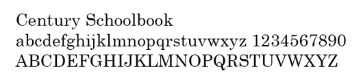
NEW CENTURY SCHOOLBOOK TYPEFACE
It is a Serif Font. From research: http://www.thebookdesigner.com/2010/11/the-century-typeface-an-american-original/ I have found that Century isn’t one typeface. "It’s actually a family of related designs all based on an original by American Type Founders. The original was designed by Linn Boyd Benton in 1894. Despite it’s origins in the nineteenth century, Century remains popular especially in textbooks, periodicals and literature. One of Century’s main strengths is its exceptional legibility. The open forms of the letters allow for quick recognition, and you might recognize some of the Century variations as the typefaces in the very first books you learned to read.
For a different look to a narrative book, try one of the fonts from the Century family for a strong and readable American typeface design. In fact, Century is so legible and neutral in tone, it’s required by the U.S. Supreme Court that all briefs presented be typeset in the Century family."
FABULA TYPEFACE
Unfortunately I would need to purchase this one... :(
From research (http://www.kidstype.org) Fabula Typeface I have found about its:
"Stylistic qualities
Fabula has a number of characteristics that the project team held to be important for children’s reading:
– long ascenders and descenders to help identify the word shape
– an informal ‘feel’
– rounded stroke ends
– a rounded ‘e’
– a clear distinction between characters that might be easily confused, such as ‘a’ and ‘o’, and small letter ‘l’, capital ‘i’ and figure one.
A particular feature of the first iteration of Fabula was that it has a double storey ‘a’ as standard to make as much difference as possible between characters that children sometimes confuse, such as ‘o’ and ‘a’. Our work has suggested that children may not necessarily find non-infant characters (in particular double storey a’s and g’s) problematic. Most children in our study were well aware that there were different forms of a and g, and some even made the point that a is what we write and a is what we read. It was also the case, however, that some children perceived than ‘a’ and ‘g’ as ‘harder’ ‘a’ and ‘g’, and while this did not appear to affect their ability to read, it may have some impact on their motivation."
Original version of Fabula
***
TITLE IDEAS:
"Foraging for Treasures"
"Poems from Woodlands"
"Poems and Rhymes, Mushrooms - Don't Fright "
"Adventures and Woodland's Treasures"
*** BOOK COVER It will have to be something that will catch child's attention, very colourful. I can even be more creative with a font!
I have research some information from BRITISH COUNCIL WEBSITE about the IMPORTANCE OF RHYMES during children's lives. They not only learn much quicker, bond with the parents but the rhymes stay in your mind for a very long time. Children love rhymes - as well as many adults. It is the first step for them to feel confident while speaking. They love the sound of rhyming words! Also rhymes are great for children with a short attention spam. Interestingly rhymes are described as PORTABLE PLAYTHINGS! How true is that - they have them in their mind wherever they go!
I truly believe that my idea will be very powerful and memorable!


