Monday 14 May 2012

FINAL LOOK


Here is my final design

COVER


OPENING PAGE


PAGE 1 & 2


PAGE 3 & 4


PAGE 5 & 6


PAGE 7 & 8


ADDITIONAL FEATURES:


POCKET SIZE BOOKLET WITH VARIETY OF MUSHROOMS, FACTS  AND IMAGES. 


PAGE 14


THE BACK OF EACH CARD IN THE BOOKLET AS WELL AS ON PAGE 14 IS COLOURED EITHER RED OR GREEN IN ORDER TO KEEP VISUAL RECOGNITION FOR POISONOUS- RED OR EDIBLE - GREEN TYPES.

Thursday 3 May 2012

THE TITLE AND GOOD OLD OWL!


Having tutorial with Ali, certainly helped me to improve on my design even further. The owl had to go and change its looks. Also I needed to reconsider the title: proportion wiring the space given, increase the font to stand out more. So I have changed it to 

LET'S GO MUSHROOM HUNTING!

************

MY OWL: 


My owl went metamorphosis but that is the one I will use. Perhaps the change with her glasses and ears will still need amending...but that will be done in Illustrator and Photoshop. 

FINE WILD FOOD

What a fantastic lunch! With so many different dishes to taste. 


The dandelion fritters were very inspirational and I even made some of my own - children loved it!


Monday 30 April 2012

BRITISH WILD FOOD

I have watched very interesting series OUR FOOD: WEST OF SCOTLAND on BBC2 and last weeks one was about mushrooms as well as other wild food in West Scotland:


http://www.bbc.co.uk/iplayer/episode/b01gw5ny/hd/Our_Food_West_of_Scotland/


Giles Coren takes us on a great journey. It is good to know that the basic skill of hunting and foraging are still known and practices on a daily basis. Botanist James Wong is on hunt (in Argyll) for a gourmet food for free! - MUSHROOMS...often being overlooked. He said: " to us British we are a little bit reticent about eating wild mushrooms" "Mushrooms are nature's recyclers"... which makes me think of mycelium! 


Moist climate of Scotland and Autumn is a perfect time for mushrooms. James carries on saying that mushrooms are "Serious Gourmet food that's growing out there on a car park, and no one has a clue".


Scarletina Bolete - a very interesting one!

****
Then come TWO GREEDY ITALIANS. SERIES 2 - STILL HUNGRY on BBC2

http://www.bbc.co.uk/iplayer/episode/b01h02gt/Two_Greedy_Italians_Series_2_Still_Hungry_Liguria_and_La_Bella_Figura/

 programme where both chefs explore Italian culture and cuisine. An this weeks Gennaro and Antonio meet a woman who lives a very simple life at the top of the mountain and makes use of the wild plants that some would call weeds.

BOTH PROGRAMMES ARE SO WORTH OF WATCHING!

BOOK PAGES FINAL-ish

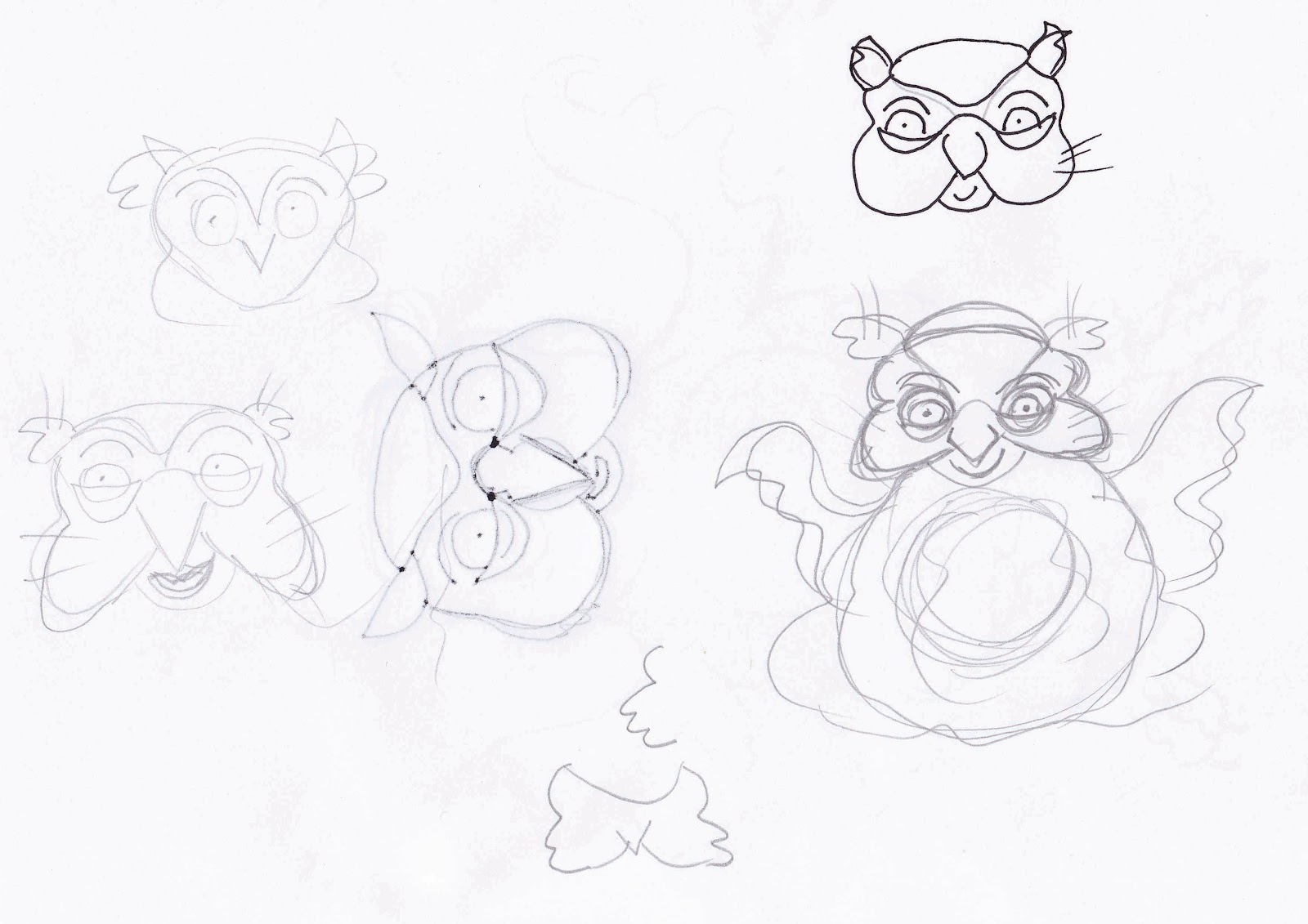
I have been working towards the end product now. Improved details from User testing questionnaires but there is a matter of an owl. One person mentioned to design different owl, so I did - much simplified. 
I have spoken to few children including my own about the outcome and it was not approved. Saying that I do agree with them.... I have realised that the owl in my previous post looks too scary and uninviting, therefore I have decided to go back to my previous on - the one from user testing, add few missing lines and changed colours - and the results are much better. Pleasant looking owl. So here it is:


COVER:

When I printed the cover the brown tree that covers the spine looks too washed out, therefore I have made a change by covering the spine in red block of colour; the outcome of it is much presented and visible type. 
The back page - I have changed the font from Noteworthy to Gabriola at 22pt - in my opinion it looks more appealing and the roundness of the letters give the impression of an autumn wind movement. The book cover will have a widow pop-up at the bottom left hand corner:


As the reader opens the window he/she will see the mushrooms:


I have created the above page with the use of the photoshop. I wish I could take my own pictures! Unfortunately that is one of the constraint...time scale.


PAGE 1 & 2

PAGE 3 & 4

PAGE 5 & 6


PAGE 7 & 8


ADDITIONAL FEATURES:
As additional features, I have already mentioned that I will produce cards - in a form of pocket booklet, easy to carry to the wilderness. There will be 2 kinds - the red cards and the green cards. Red of course will give a warning and it will mean that this particular mushroom is poisonous, green on the other hand are edible mushrooms. All spiral bound. 


PAGES AT THE END OF THE BOOK:


If times permits I would like to create at least one page of flaps with pictures of mushrooms. As they open the back of them will be coloured red or green - AGAIN EMPHASISING THEIR EDIBILITY and they will contain facts on the revealed spot.


Saturday 28 April 2012

PROTOTYPE OF MY BOOK COVER...

At present I am doing work experience at Pendragon  - Company at Malvern who produces packaging. I had this fantastic opportunity to design a prototype for my book cover! 
I have experimented  with 2 designs:


 - one with cut out window
 - the other on with hide and reveal window

...my hard work at Pendragon:
... designing a prototype book cover ...


there work involved creating an appropriately measured cards in in  CAD software called KaseMake (purely designed for packaging use)  ready for to be cut out on the platform, then completed in the factory by gluing all together. It was fun!


***
I have decided to put forth the second one ( hide and reveal), simply because it emphasises even more my idea of mushroom hunt - just as the title suggests. I have listened to children with regards to natural depiction of nature, additional features: a window and the results are truly satisfactory and affirm my belief that this book is a perfect solution to the brief given.


Monday 23 April 2012

IMPROVEMENTS BASED ON USER TESTING

So I have listened to the voice of my audience and have improved my design to much appealing one. I am very happy with the results. I have to say that the user testing part plays a big part in any design. Every time it proved to be fruitful and resulted in desired outcome. 
I truly enjoy designing for children; not only because I have two of my own but also I believe they are our future and we need to shape it to the best of our abilities. 

BOOK COVER:
PAGE 1 AND 2:
PAGE 3 AND 4:
PAGE 5 AND 6:


...
Additional features to work on ...


SKETCHES...AND COLOUR

I have been doing more sketches...and working with illustrator and photoshop.... for the cover


Changed colours of the mushroom and nome's trousers...


RESEARCH - ECO PRINTING

I would like my book to be printed on sustainable material with vegetable or soya ink; environmentally healthy and for the children. I do understand that for children of my chosen audience: 5-7 years old that might be quite difficult due to variety of colours used in order to enhance their liking but I still believe that it is possible. 


I have researched some of the companies in UK that do offer sustainable printing:


http://www.geniedesignandprint.co.uk/GreenPrinting.html


The company sent me a booklet with all variety of recyclable paper. Fantastic!

http://www.printwell.co.uk


http://www.seacourt.net


http://www.menzies-nunn.co.uk/flash.php


http://www.azimuthprint.co.uk/


............ I could go on. But for my design to work along side foraging  it has to be sustainable. This is the way designers need to go! We have responsibility not only to produce sustainable design but also to educate those who use our services.

Wednesday 18 April 2012

RESEARCH - USER TESTING QUESTIONNAIRES

Today at my local school - Comberton Primary school -I have met up with 22 children (13 boys and 9 girls) of the age between 5-7yrs and got some fantastic results!! 
That was an amazing opportunity for me!  Children were engaging with me very well and they were very keen to fill User Testing Questionnaires by answering 16 questions. 
After that that we also had a brief chat about my book design! They loved it! They even would love to buy the book when it comes out. I have  rewarded children with badges and sweets.

Additionally to that I have asked my 2 nephews about my book also.


And here are the results of 16 questions: first 8 questions were relating to pages 1, 2, 3 and 4:

1. Do you like the look of these pages?
100% - all children liked it,

 OUTCOME - 100% POSITIVE

2. Do you like the colours?
20 children liked the colours,
2  children said they don't like the white and 1 child said he likes the red.
1 child did not answer

OUTCOME: MAJORITY of THE CHILDREN 98% LIKE THE  COLOURS

3. Which colour don't you like?
11 children liked all the colours
3 children said they don't like the brown mushroom in gnomes hand, and 3 children didn't like the brown
1 child said he does not like the green colour
4 children said they don't like the white
1 child said he does not like black
2 children did not answer this question

4. Do you like the letters?
21 children liked the letters and all were able to read the rhymes, and one commented that she likes the mixture of fonts!
1 child did not liked the letters
1 child said that the letters stand out because they are black and bold
1 child did not answer

OUTCOME:  MAJORITY OF THE CHILDREN 98% LIKE IT

5. Which picture do you like the most?
2 children did not answer the question
7 children liked the real image of a toadstool and one said he likes real pictures because he likes the nature!
10 children liked the real image of Chanterelles
2 children said they liked all of them
1 liked the owl
2 children said they like the gnome
2 children liked the maze

therefore the majority of children did like the real depiction of mushrooms.

6. Do you like the rhymes?
23 children liked the rhymes
1 said there should be more information about mushrooms

OUTCOME:100% CHILDREN LIKE THE RHYMES

7. What don't you like on these pages?
1 child commented that the trees by the maze should be real trees not cartoon like
1 child did not like the white spots on the toadstool
3 child did not comment
18 children liked the pages

OVERALL MAJORITY OF THE CHILDREN LIKE EVERYTHING.

8. What would you change?
19 children answered THEY WOULD CHANGE NOTHING
1 child said he would mark finish line ( I believe he meant the maze)
2 child said she would change some of the rhyming words - more info about mushrooms
2 children did not answer

***************
Next 8 questions were related to the book cover

1. Do you like the book title?

20 children liked the title
2 children said they don't not like the title
2 children did not answer the question

OUTCOME - MAJORITY OF THE CHILDREN 98% LIKE IT

2. Why?
4 children gave no answer
said because you find out about the mushroom, and 1 child added she likes mushrooms
3 children commented to make the title shorter
2 children said because it is a hunt
2 children said because it is in a speech bubble
1 child said because she likes the picture
1 child said because it is colourful
1 child said because it is bright
1 child said because it id good
1 child did not understand the question
4 children said just because I like it
2 children said it is funny

3. Do you like the letters?
21 children answered  YES they do.
1 child did not answer
2 children did not like it, and one of them commented because they are all the same

4. Do you like the colours?
1 child did not answer
1 child's answer is not clear
19 children said they like the colours, and one of them said she thinks is colourful
2 children said to make them a bit lighter
1 child said to make the cover more colourful

5.What do you think about the owl?
3 child did not answer
1 child said it is good because it speaks
1 child said to make the owl's mouth open  - like he is talking
1 child said that the background is too dark
2 children  said  it is too dark
1 child thinks the owl is wise  and likes it
1 child thinks the owl is freaky
1 child said the owl is cool
1 child thinks the owl's face is funny
12 children liked the owl, they think is very good, ok, brilliant

OUTCOME - MAJORITY OF THE CHILDREN LIKE IT, BUT I WILL DO FEW CHANGES


 6. Do you like the gnome and the mushroom?
3 children did not give answers
18 children liked them
1 child said:maybe
1 child said to make them bigger
1 child said to put the mushroom next to gnome

7.What would you change?
1 child did not answer
4 children said to add more information
1 child would change the letters
3 children said they would put the owl on the tree or in the window
1 child would make all bigger
2 children would change the letters
10 children would change nothing

1 child would add more pages

8.Do you like the size of the book?
4 children did not answer
16 children liked the size of the book and one of them also commented that it is the right size for a book shelf
4 children said the book is too small
The teacher and the teachers assistant commented that the have not seen square book and it is a good idea.

Tuesday 17 April 2012

LONDON TRIP - TASK

TASK: Source three different innovations relating to children’s book design or to book publishing as a whole. These could be in connection with the design of the book, illustration style, graphic design, format, added features or could relate to an emerging trend in book publishing.
- Give a brief description of your chosen element.
- Explain how it has been used within the design of the book or is connected to book design /publishing.
- Describe / explain why you consider it to be innovative.
 - Consider whether you think it has been used appropriately or is suitable for children. Explain your answers.


My chosen innovations:

1. IMAGE BOOK FACTORY  -  Dutch publisher 


 - This element is an additional feature in a form of a hand puppet.
 - It is interactive and works alongside the story with powerful images.
 - I have chosen these on a whole relating to book design as well as the publisher. The additional features, really bring smile on my face and are truly innovative! to see the whole collection of them makes it even more desirable to buy them all and have  great time while reading it with children! I know that my children would love those hand puppets incorporated into a story book.
 - Has it been used suitable an appropriately? Definitely! because it not only will help children to want that book but also will encourage their imagination.The puppets are friendly looking and help to bring the story to life!


What is more, the publisher has variety of other different designs which are fresh, and I innovative.   For example these:

- Projection Books - innovative concept of interactive book! Fantastic! Original and fun!:


- Book gift boxes: Pizza book in a pizza box ( perhaps the pizza cutter could be plastic or more child friendly):


2. TALKING DICE from LINGUASCOPE publisher from London


 - Talking Dice. Those are dice that children use while learning or improve a language.
 - Every image means and looks the same wherever you go around the world, the other difference is the spelling in variety of languages. What is more the dice help develop vocabulary, aid special needs children as well as speech and language therapy. The dice can be used by the teachers, parents as well as therapists. 
 - I have chosen these to be innovative because they are multifunctional, the images on them can be set in variety of topics like: drinks, occupations, pets, sport and many more or on their own. The learning becomes fun for all, not boring drill of vocabulary. The dice develop children's imagination: as they throw the dice they make up a story using the images on the upturned faces of the dice.
 - This innovative idea is suitable for children of all ages and different stages of learning because era accessible to all. I love it!


3. MAKE BELIEVE IDEAS CATALOGUE  - publisher from Hertfordshire

... I could talk about The Cube...


But I think everybody else will be tempted to talk about it. What I have noticed to be different is a VERY SPARKLY COVER of a MAKE BELIEVE IDEAS publisher catalogue. 


 - It has very different design in comparison with other catalogues. At first look I thought it was a book and to my surprise it wasn't! I believe it has been designed in connection with new titles/series coming up later this year about Sparkly Bags.


Also the previous series has rhymes in it ( appropriate to my own design) filled with simple, yet beautiful illustrations - REAL representations of items in it.


- As mentioned above the cover has been cleverly designed  - SPARKLY to attract the audience. Even the font of the publisher's NAME id very distinctive and different, and works well with all magical MAKE BELIEVE IDEAS.
 - The suitability for the children. It proved successful - because even my own children thought it was a story book not  a catalogue. Apart from the cover,  the books about GLITTERY BAGS are designed suitably for younger audience: every girl, I am sure, will love it. Easy to hold as it has a handle, good size and comes with variety of additions. 
The publisher definitely knows what the audience would like!