According to Scieszka, he writes books because he "loves to make kids laugh". Most of his best-known works were written in collaborations with illustrator Lane Smith, who does the artwork for Scieszka's words.
Known books:
"The Stinky Cheese Man and Other Fairly Stupid Tales"


Good collaboration between designer (Molly Leach) and illustrator, where story and illustration play with text, the cheese is so stinky that even the text melts.
When Jack gets squeezed by a giant the text goes smaller and smaller. Leach was breaking the boundaries. Colour was used cleverly within type.
"The True story of Three Little Pigs"

The importance of layout and design was developing slowly.
ABC book Circa 1850's and Janet & John Book 1940's:


Early 1900's the layout was considered in more details due to Art Nouveau and Art Deco. During that time artists were experimenting with techniques and new styles. period was full of dynamism and excitement swell s radical changes.

................
Art style has an impact on poster designs also.Childhood started to be recognised as being different from adulthood; and was filtered into children's book design and processes.
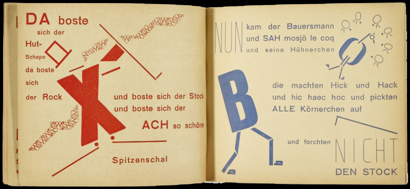
The Scarecrow Fairytale: A Collaboration of Theo Van Doesburg and Kurt Schwitters:
http://www.jstor.org/pss/1511700
They focused on similarities rather then differences. In effect creativity and original work emerged and radical TYPOGRAPHY.
The Noisy Book by Margaret Wise Brown and Leonard Weisgard

He was inetersetd in Russian Modernism, which reflects in his design: geometry, integration within illustration to enhance the narrative. He had passion for children's book and developing their imagination.

...Vibrant colourful pages within this book are celebration of his love towards children's book illustrations.
.........
There Was an Old Lady by Simms Taback
Style: Hand rendered style, bold strong colours. Stye of the type reflects the story, itself - complements. Linear style, decorative with speech bubbles:

....................................
CHOOSE THE RIGHT TYPEFACE - CONSIDER:
- Breaking rules is acceptable
- How old is the audience?
- How much text will be on each page?
- What mood, feeling, style it portrays. Create your own style?
- Is the book intended to be read by children?
- What book type is it?
- What's the content?
SERIF or SANS-SERIF?
Sans-Serif:
-creates more contemporary look,
-for smaller block of text
-for titles or headers
-more likely to have different version of a's and g's
-used in newspapers and mags
Serif:
-classic text
-used within more text
-easier to read, as it is more familiar
EDUCATIONAL FONTS:
Sassoon Primary by Rosemary Sassoon in 1990's
Infant Gill Sans
-one story of a's and g's
-ascenders and descenders are extended
-rounded open counters
-medium weight
-larger x-height
DISADVANTAGES:
-considered as a school book type, baby-iesh by older children
-not appropriate for larger blocks of text; 2-3 lines only
RESEARCH
The Songs The Letters Sing: Typography & Children's Reading by Sue Walker
shows research on how children respond to reading typefaces.
Both serif and sans-serif does not affect children's reading but affects their motivation to read.
Younger children prefer familiar fonts. Tight letters are considered as difficult to read; therefore space between line was of a great importance.
HIERARCHY
Consider what needs to be in serif and sans-serif, emphasise title text in bold.
text needs to complement the story, reflect feeling of the story and enhance imagery.
No comments:
Post a Comment